Mapping COVID-19: Millions Rely On Online Tracker Of Cases Worldwide
LISTEN
BY MELISSA BLOCK
For the latest COVID-19 statistics, updated in near real-time, millions of people around the world have been turning to an interactive, web-based dashboard created by a small team at Johns Hopkins University in Baltimore, Md.
From its humble beginnings, that dashboard has become one of the world’s most authoritative sources for the latest coronavirus numbers and trends. The Hopkins project has filled an information vacuum, providing the most up-to-date, comprehensive picture of the virus’s global scope and spread.

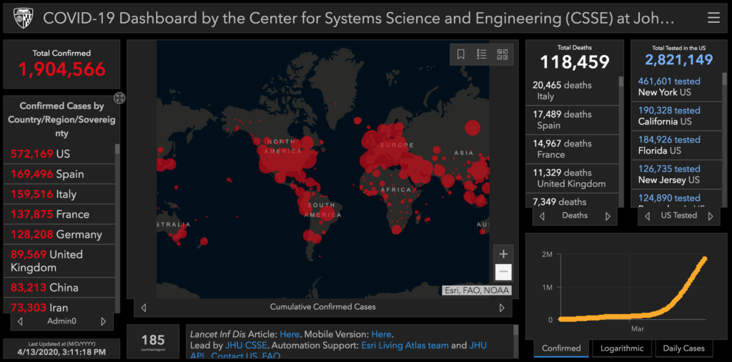
The interactive, web-based dashboard created by Johns Hopkins University in Baltimore, Md., as seen on Monday at 3:11 p.m. ET.
Center for Systems Science and Engineering (CSSE) at Johns Hopkins University (JHU)
The dashboard was born, as these things often are, under the influence of caffeine.
“We were sitting around a table. We were all drinking lattes,” recalls Lauren Gardner, 35, associate professor of civil and systems engineering at Johns Hopkins.
This was back on January 21st. Gardner, whose specialty is modeling the spread of infectious diseases such as Zika, dengue and measles, had been paying close attention to early reports of a deadly new virus spreading in China.
At that meeting over coffee, she asked Ensheng Dong, a first-year PhD student she advises, if he had been following news of the coronavirus. He had. Dong, 30, is from Shanxi province in China, and he knew there had been confirmed cases in his hometown.
“I really worry about my family over there,” he told Gardner.
What’s more, Dong has a lot of friends who live in Wuhan, which was then at the heart of the epidemic.
“I could see their numbers growing larger and larger every day,” Dong says.
Professor Gardner had an idea.
“She mentioned, ‘Why don’t we make a dashboard?'” Dong says. “I’m thinking, yes, why not?!”
So, Dong got busy, and by that same night he had created a dashboard showing cases of the novel coronavirus that would later be named COVID-19.
Back then, his map was splashed with just a smattering of red circles, indicating a grand total of 320 confirmed cases. Nearly all of them were in China; there were a handful more in Thailand, Japan and South Korea.

Ensheng Dong, a first-year PhD student who helped create a dashboard showing cases of the novel coronavirus that would later be named COVID-19.
Courtesy of Ensheng Dong
Over the months that followed, as the epidemic turned into a pandemic, and as the number of confirmed cases grew from several hundred to nearly two million, Dong watched those red circles on the map spread steadily and fast, all over the globe.
“It’s kind of a bloody map,” Dong says. “There’s so many red dots everywhere.”
In the first few weeks, Dong was entering all of the data by himself, manually plugging the numbers of confirmed cases, recoveries and deaths into the dashboard. That quickly turned into a monumental task. Now, nearly all of the data is entered automatically.
As the dashboard grew more popular and demand surged, there were times when the servers crashed.
“Actually, if I ever knew that this project will go [so] big, maybe I would [reconsider doing] that!” Dong jokes.
For Gardner, who manages the dashboard project for the Johns Hopkins Center for Systems Science and Engineering, it’s a role that’s become all-consuming.
“I didn’t envision being dashboard person, that’s for sure,” she says, noting that the dashboard she first envisioned as a valuable tool for academic research has evolved into something far bigger.
“I think what we massively underestimated was the general public’s interest,” she says. “It didn’t even cross our mind how popular the interface would be…. People are just really desperate for information that they trust.”
The Hopkins team scrapes their numbers from dozens of sources, including the U.S. Centers for Disease Control and Prevention, the World Health Organization, the European Centre for Disease Prevention and Control and the National Health Commission of the People’s Republic of China, as well as U.S. state health departments and media aggregating websites.
The dashboard team has grown from two members to a couple of dozen, and they’re constantly working on new features. This week, they’ve added maps showing per capita rates of COVID-19 testing, hospitalization and incidence, as well as case-fatality ratios.
The team would love to have other data made available, including the race and gender of COVID-19 patients, according to Dong.
The Hopkins dashboard is open-source, made freely available to users. Thousands of other dashboards, including NPR’s, pull the Hopkins data into their own. “And I think that’s awesome,” Gardner says.
Beyond the snapshot of what is happening now, the data are also being used to do modeling, which in turn drives state and federal policy. “We’re absolutely doing short term forecasting,” Gardner says, “looking at, what are the next spatial hot spots? Where should we be allocating resources to better prepare for the next city or the next state that’s gonna see a surge in cases?”
The Hopkins team also recently joined in a study from NASA, modeling how climate and seasonality are contributing to the coronavirus outbreak.
As the dashboard project goes on, Ensheng Dong says what began with him worrying about his family in China has flipped. With the U.S. now bearing the brutal brunt of the pandemic, he says, it’s his family’s turn to worry about him.


